This article was originally published in the January 2016 issue of VRAI Magazine.
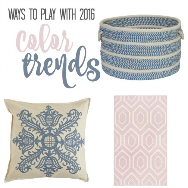
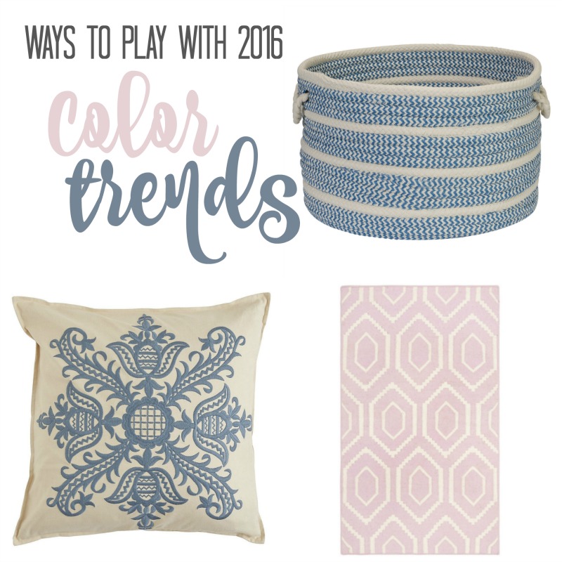
Each year, the Pantone Color Institute introduces a color of the year. Described as “a color snapshot of what we see taking place in our culture that serves as an expression of a mood and an attitude”, these color trends can be found in everything from fashion to home decor. For 2016, Pantone has introduced two colors: Rose Quartz, a soft, sweet pink and Serenity, a tranquil pale blue. Combined, these colors balance warm with cool to create a sense of peacefulness. Read more about why they were chosen here.
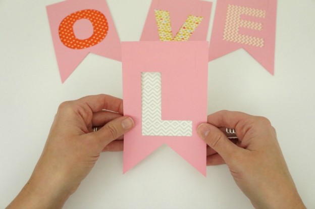
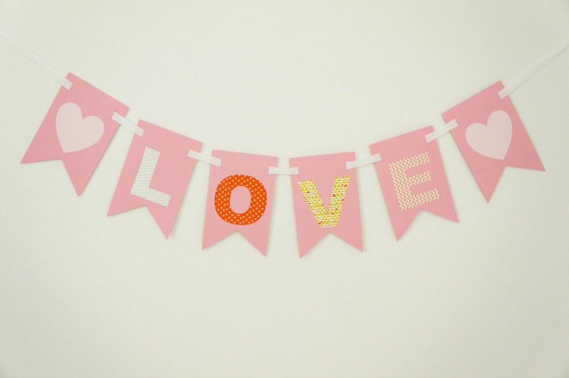
I personally don’t believe in overhauling your home to suit the new trends that emerge each year, but I do love to look for ways to include these color trends into my existing home decor. If you’re looking for ways to incorporate some new and different touches into your home in 2016, the Pantone Colors of the Year can be a fun way to freshen up your decor or add a new splash of color.
Continue reading →