I like color. I’m generally not afraid of it. But for a small moment, I seriously wondered what in the world I’d do with our orange dining room. Tom’s been on a mission to re-paint it since the last coat dried. But I asked him to give it a chance.
Let me get my decorating hands on it and see what I could do.
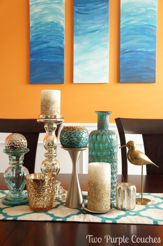
So, we started with a big, shiny, neutral mirror. Then we added a trio of abstract paintings.
And now, a few finishing touches later, the dining room decor dilemma doesn’t seem so daunting.
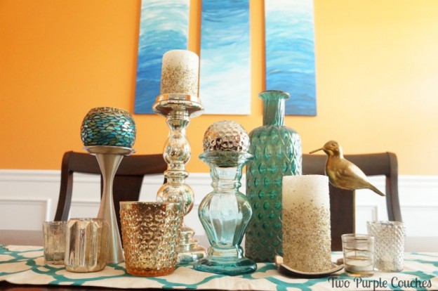
Orange, meet Teal. I think you two will really hit it off…
I may be completely making this up, as I have no formal training in decorating or design, but I believe that sometimes, to make a color work, you need to add more of it! Just in a completely different hue, that is.
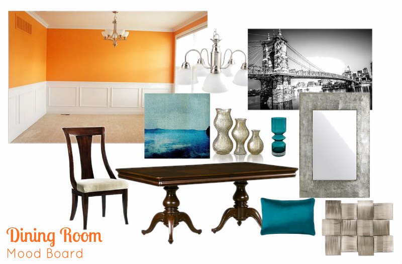
When I put together this mood board back in March, I was envisioning much more neutral art and accents. Black and white photography, monochromatic frames, brushed nickel. But something about this felt too cold. And so I added those tiny splashes of blue to the board. As Orange’s complementary color, I figured they’d play nicely together.
After I painted up this little canvas inspired by the blues and teals of the Gulf of Mexico, I wandered around the house trying to find a good place to display it for the summer. As I passed our dining room and did one of those stop-then-walk-backwards moves.
I held it up next to the orange wall.
>insert lightbulb moment<
I screamed for Tom to come and see. He probably thought I’d seen a spider.
And just like that, my whole design vision shifted. Instead of black and white and neutral, this room needed more color! It needed peacock-y teals! It needed deep blues! It needed azure and aqua and turquoise!
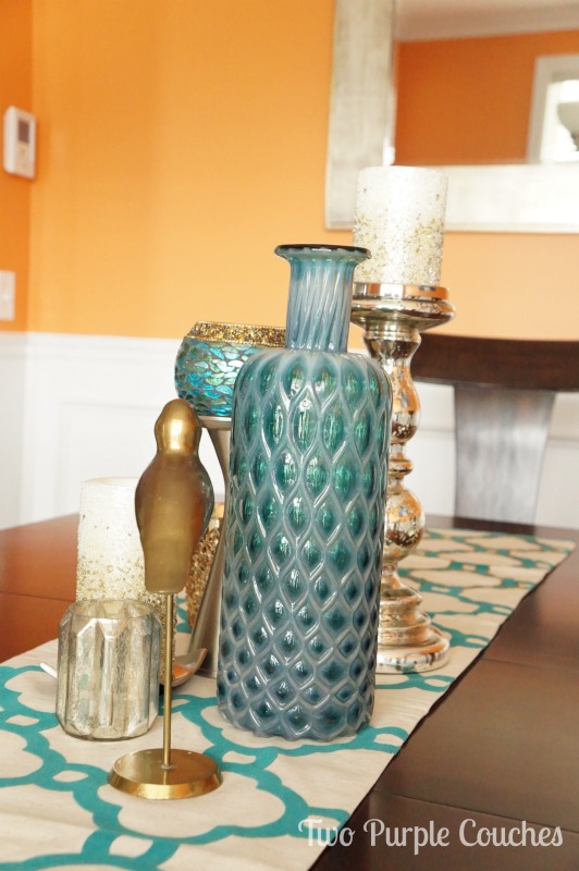
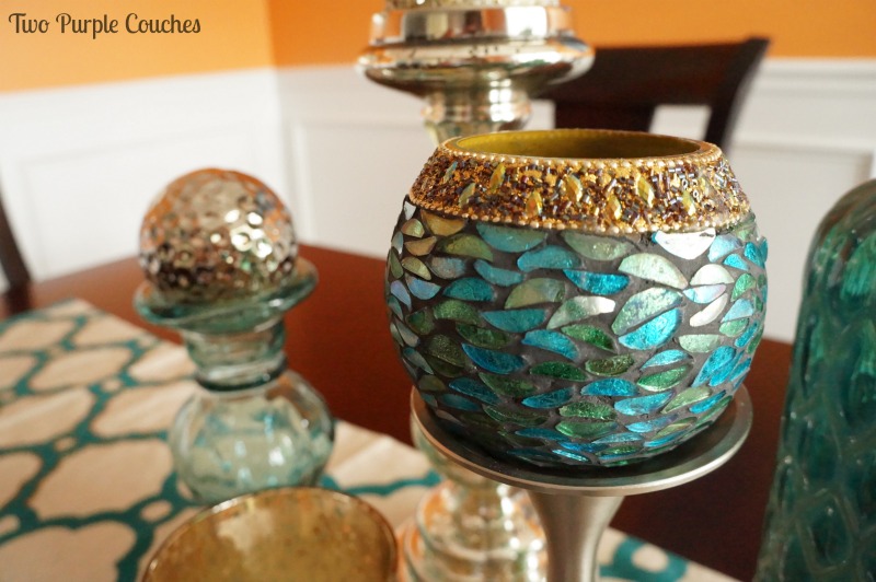
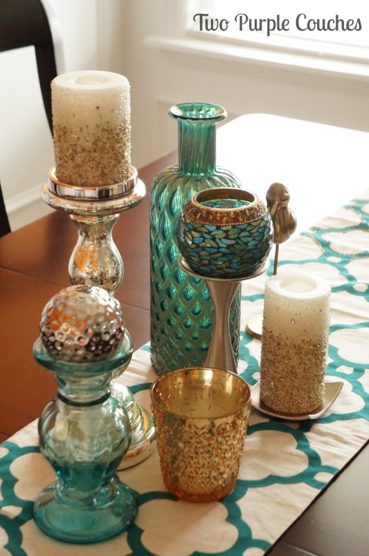
And that’s exactly what it got! Plus a bonus of brass, gold and mercury glass.
Because you can never, ever go wrong with flashy neutrals. At least not in my design book 😉
Sharing with: Share It Sunday


Love it!! xo
Thanks Cindy 😀
This might be the most vibrant and beautiful dining room ever. That is all :).
Shannon recently posted…The Power of Specificity Turns Your Passion Into Financial Success
Awww, thank you Shannon! 😀
Lovely!
Thanks Tricia 🙂
Stunning! I love the color combination!
DeDe@DesignedDecor recently posted…Chunky Ornate Tables Find a New Life!
Thank you so much DeDe!
Love!!! Complementary colours are always a win and I love that you used them in a non obvious way – meaning, not primary blue, but teal instead. It looks so vibrant and modern in there. I’m a huge fan! Hopefully Tom is now too!
Thalita @ The Learner Observer recently posted…One Room Challenge 2014: Week 2
Thanks Thalita! I’m a huge fan, too, and I think it’s growing on Tom 😉