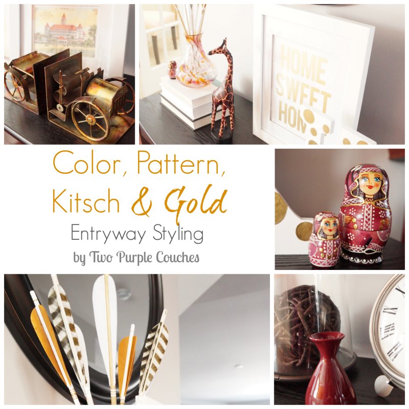
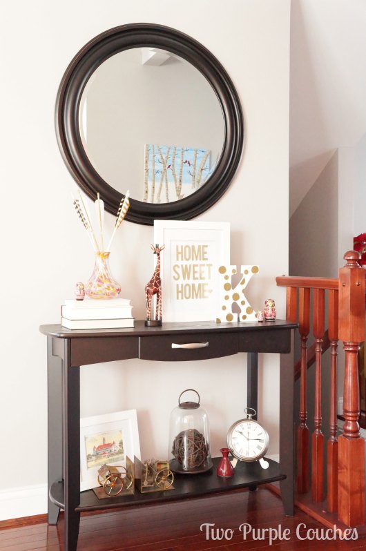
Christmas is long gone. And I’m tired of winter decor because I’m tired of winter. So I guess it’s time my entry console table gets an update. And I think I’ve found my perfect equation for creating looks I love: color + pattern + kitsch + gold!
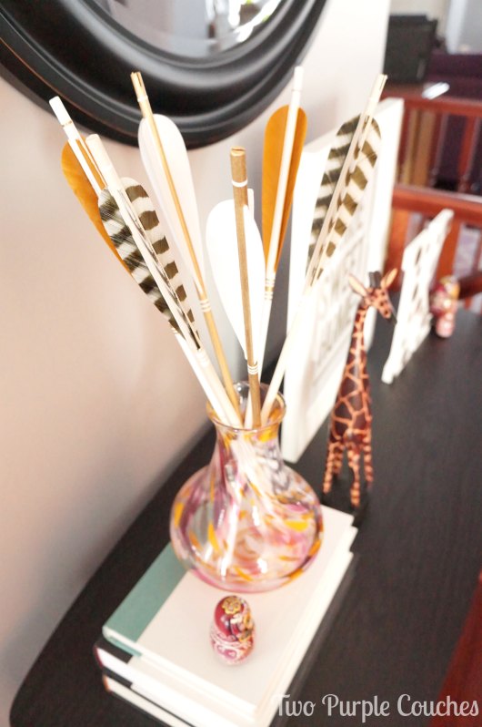
Try as I might, I will never be a neutrals-only girl. I love color, and I love it dearly. There’s nothing super-bold happening here, but I love the swirls of purple and yellow in my blown-glass vase, plus the little pops of fuchsia-red thrown in.
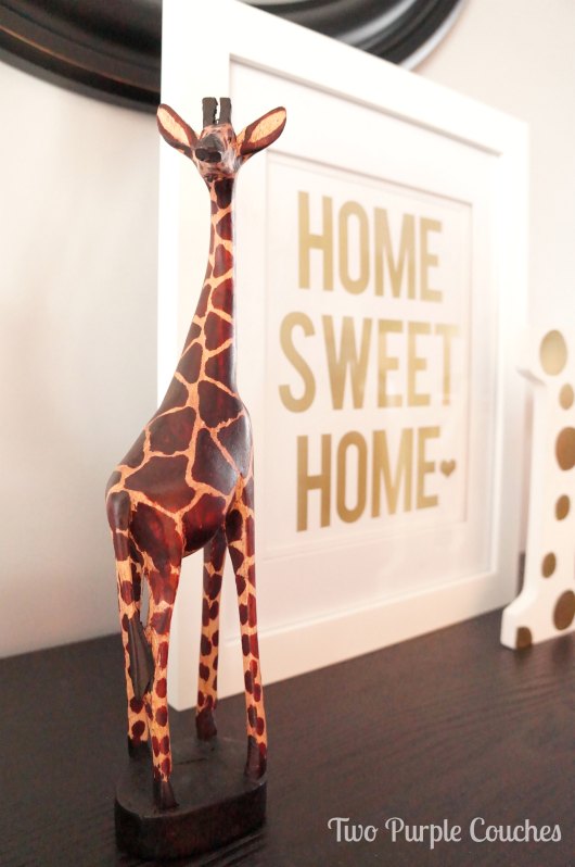
Who goes to Disney World and comes home with home accents? Me! I was browsing shops at the Animal Kingdom park and could NOT pass up all of the fun statues. This giraffe, plus a wooden zebra-patterned dish and small carved hippo, came home with me. I’ve realized that I have a thing for touches of animal prints. And I am not afraid to show it!
Now, I realize that what I call kitsch isn’t really true kitsch. But I personally define kitsch as something a bit quirky or unique, or something that holds a special story or meaning behind it. So let me tell you the story behind my set of matryoshka dolls: four years ago, I traveled to Moscow on a business trip. This was my first time traveling outside of North America, and I spent my entire week in Russia inside of consumer research facilities and conference rooms. Oh, and a Russian shopping mall. I was staying within a few miles of Red Square and never saw it. My only token of the trip is a bottle of Russian Standard vodka that I purchased at a grocery store inside the Russian mall. Later that year, my parents were touring Alaska and bought me this colorful set of matryoshka dolls from an authentic Russian store as a sort of joke, to give me something to “remember” my trip by.
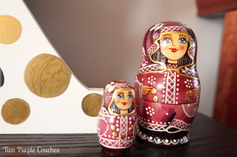
The detail on these dolls is incredible! And I’m glad I’ve finally found a good spot for them.
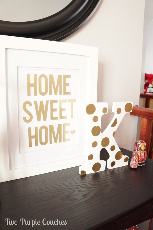
I am still so in love with this gold-foil “Home Sweet Home” print from Flourish & Hope, and the polka-dotted “K” I created to pair with it. Just a lovely golden glow to brighten up our entryway!
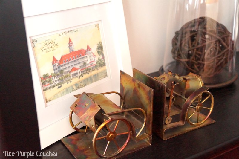
The patina on my new “jalopy” book-ends is gorgeous, and they pair quite appropriately with this framed postcard from the Grand Floridian resort where we stayed in Disney World. Kind of love this turn-of-the-century vibe! And I didn’t realize how nicely these two things went together until a friend of mine pointed it out!
I’m pretty happy with this arrangement. I think this look is here to stay.
Maybe… You know how much I love to change my mind!
Linking up with…
Lovely!!! I love your equation, especially the gold and kitsch parts 🙂 Also, that giraffe is darling!
Thalita @ The Learner Observer recently posted…The Whole30 – Week 2 and Salad Dressing
Thanks my dear! I love the gold and the kitsch parts, too!
Pingback: Light ‘em Up-Up | two purple couches
Pingback: Updated House Tour: Entryway and Dining Room | two purple couches
I love all of this! I’m all about personal pieces and decorating with them. I think it makes it so much more unique and special! Beautifully done. 🙂 Visiting from Creative Spark 🙂
Amanda @ Dwelling in Happiness recently posted…15 Inspiring Chalkboard Party Ideas
Thank you Amanda! I completely agree – personal pieces are what make our homes special!